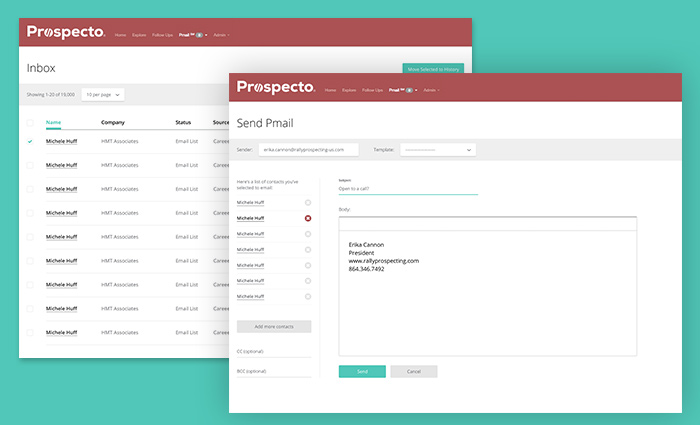
I designed and prototyped an updated interface as part of an overhaul project for the Rally dashboard web app. Our goal was to create a more accessible, consistent experience for agents using the app.
Process
BoltAffect provided me with user research from their recorded sessions with Rally and notes on user interaction with the existing app. I was also give access to samples of the existing screens for reference and content. From this information I determined pain points with the user flow for the Rally Pmail system. What we found was lack of clear identifiers between similar screens and inconsistency throughout the existing interface. Second, we learned that many of the functions the agents used regularly were hidden from view or relegated to a very small percentage of the screen.
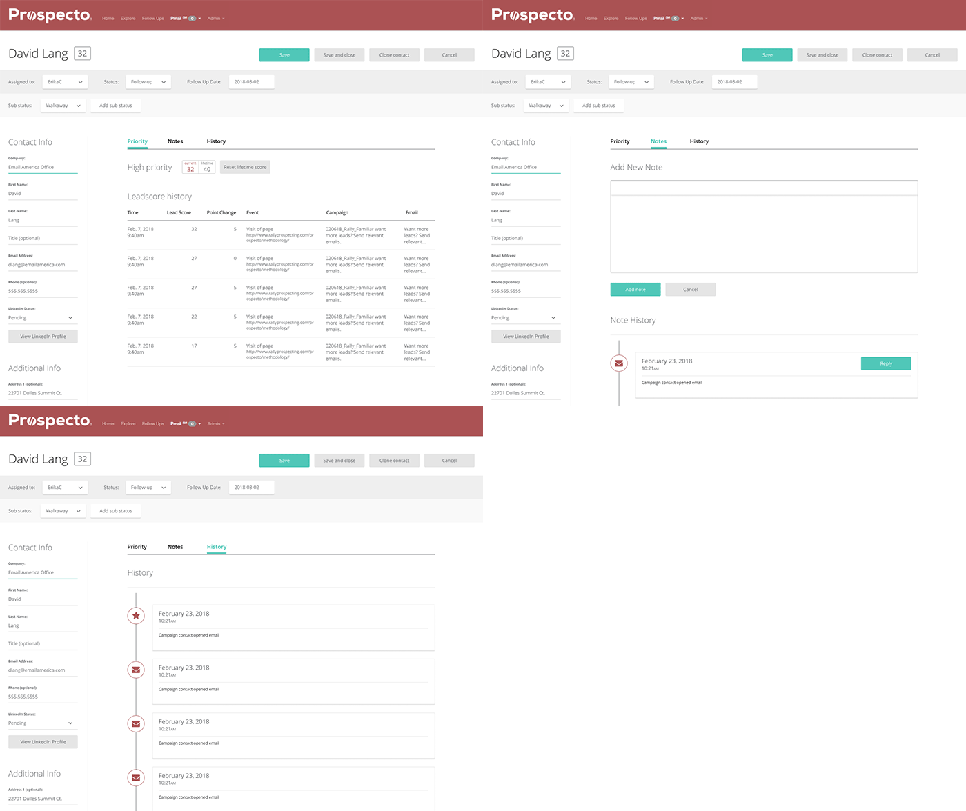
My first task was to eliminate the inconsistencies in the interface. To do this, I developed a uniform design language to use across the entire dashboard app. Using this system, I created prototypes to unify the structure of the app and create a consistent hierarchy on each screen. I then constructed prototypes detailing the sending and management of messages in the Pmail system. This consisted of prototypes for the inbox and history screens as well as revised message composition and contact details screens.
While the inbox and history screens were similar and their requirements were satisfied by the design system, the message composition and contact details screens presented a more complex problem. The agent messaging workflow consisted of searching for a subset of contacts and then selecting one or more of the results to message. We’d identified that the exiting composition flow failed to identify the message recipient and how to manage recipients on the message composition screen. Our solution brought the composition fields into the forefront and provided agents with a mechanism to add and remove recipients.
Our research showed us that one screen needing considerable revision was the contact details screen. The existing screen emphasized general information that the agents rarely used at the expense of critical information. Account notes that agents accessed regularly were given a tiny fraction of the screen space while lead history that determined the overall value of each contact to agents was dumped as unformatted tables and hidden from view. My solution focused on bringing this information to the forefront so that it was more accessible.
Result
The result of our user research led us to solutions that improved the overall usability if the interface and discoverability of critical information. This improved the efficiency of agents using the app.
